Mixed results this week, layout was OK, composition sucked.
Layout has taught me that crazy perspective doesn't necessarily look that crazy. Also got a feel for backgrounds. Cranked out the second pretty quick, although admittedly it was the rough one and had a fraction of the detail. So layouts are cool.
Composition came out badly.
Paper attempt was a failure, one of the educational facilitators had a look in the morning and despite heroic attempts at concealing it, could see he was pretty much withholding vomit. Anyway, took it into Photoshop in the afternoon and ripped the thing apart and made it into a poor attempt as opposed to the abomination it was in the morning. The anatomy was truly f... uhh, incorrect. Spines went at weird angles, heads sat askew, squat, stumpy, unnaturally straight limbs sat on the page and made a mockery of both God and man.
So why was it such a mess? Part of that was trying to do a more "realistic" illustration as opposed to goofy cartoon stuff which I'm already comfortable with. Sadly drawing fundamentals were sorely missing. Having said that, the figure on the ground turned out alright. It was certainly a lot stronger than the one standing.
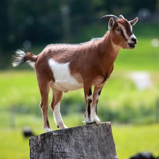
Disappointing but never mind. Let's move on. And here's a picture of a goat I found on the internet to make you feel better.

No comments:
Post a Comment
Note: only a member of this blog may post a comment.